
It Just Keeps Moving Lower Informing the Stock Market is Getting Narrower
- cornerstoneams
- Oct 21, 2025
- 5 min read

A couple of months ago we briefly touched on today’s subject title within an edition at that time. Beyond that more recent piece, we have also delved into this issue over various editions in the previous year-plus.
Every time we share this topic, we leave it with a general view that we will continue monitoring and sharing according to what unfolds within this stock market observation as time rolls on.
The central focus is that the stock market has been very narrow in its behavior. Said differently, we can say that collective market participants have been very selective in what they are willing to bid up within the stock market landscape.
Coming out of the 2022 downturn and the fresh bull market run that emerged, we have seen a strange bull market compared to that of historical new bull market moves.
Historically, coming out of a notable downturn, we will see the market at large perform robustly as participants are bidding up what seems like the entire landscape of the stock market offerings.
In this era, thinking into 2023 up to the current day, the broad robustness as described has been missing.
As offered, we have chronicled this storyline as we continue to watch for any signs that collective market participants are beginning to bid up the broad offerings that are more fitting with the historical script of strong bull markets.
The critical significance of this topic, and why we continue to be focused on it, is that in narrowly performing stock market backdrops, it is imperative, when deploying capital, to deploy capital narrowly as well lest your capital be left standing still relative to the tremendous performance of select areas of the stock market.
Narrowly performing stock market backdrops do not offer performance opportunities across any and all market capitalizations, sub-industries, and even sectors. Selectivity is crucial in narrow stock markets.
In addition to this aspect, it is also very important to continue to monitor narrow markets when they present themselves in light of history offering that narrow markets lead to problematic outcomes, given time, if they cannot find a way to broaden out.
This market setup has been operating in this manner for some time now. This stock market could really use a boost of broadening out in its performance structure to increase its health, if you will.
Our Selected Tool as a Measuring Device
There are numerous ways to address whether the stock market is performing narrowly.
A relatively succinct method is to use the two versions of the S&P 500 in order to offer a relatively easy visual.
The two versions are the equal-weight S&P 500 index compared to that of the traditionally reported, weighted S&P 500 index.
In the traditionally reported version, the S&P 500 stock index has certain companies that carry a large weight within the construction of the index and, as a result, have an outsized impact on its performance.
If a couple of handfuls of companies comprise a notable total weight of its construction, they collectively can make the stock market as a whole appear to be performing quite well, provided they themselves are trending upward via stock price appreciation.
The equal-weight version erases this potential issue, as all 500 companies carry the same weight, and in so doing, a handful of companies cannot have an outsized impact on the index performance.
By observing these two versions of the S&P 500, we can succinctly gauge what the general strength is of the broad version (equally weighted version) compared to that of the more narrow, weighted version.
To begin, below we will look at the two together in a year-to-date performance chart for 2025.
This will allow us to take a micro-time view of these two before we widen out the time perspective for a broader timeline view as we place them together in a long-term relationship chart.
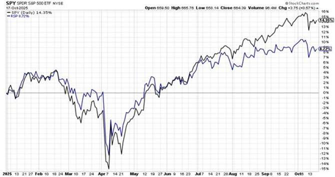
The black line is the traditionally reported, weighted S&P 500 index, while the blue line depicts the equal-weight version of the S&P 500.
While the two held together in the front part of 2025 and began to offer a stock market that was broadening out, we see from late June, through to the current day that the weighted version (black line) took off and doubled its year-to-date performance in a few months.
At the same time, the equal-weight version (blue line) only marginally increased its year-to-date performance.
As a side note, interestingly, in robust bull markets it is not unusual to see the equal-weight version exceed the performance of the traditionally reported weighted version.

Clearly, this has not been the case in 2025, nor has it been the case coming out of the 2022 downturn.
The above is the aforementioned longer-term relationship chart, which encompasses this 21st century for a broad time perspective.
When the line chart is moving upward, this tells us that the equal-weight S&P 500 index is outperforming the weighted S&P 500 index. The significance of such outperformance is that the broad stock market is fully participating.
Our red arrows denote the liftoff of new bull markets, from the general wreckage of the previous bear market, in the past 25 years.
It is customary for a new bull market to be strong and robust across the market landscape. The outperformance (line chart trending upward) of the equal-weight S&P 500 to that of the weighted version offers a broader, more robust bull market landscape.
More to our current period, our black down-trending arrow highlights the strange behavior coming out of the 2022 downturn.
Rather than the equal-weight S&P 500 index kicking into overdrive with a continuing
strong uptrend, it did a historical opposite and has essentially nosedived in comparative performance to that of the weighted version.
Adding to this, in the far right lower corner, note the short blue horizontal line.
Along the path of addressing this topic, we added this visual for an edition and continue to offer it as a breakdown reference point.
When we introduced this blue line visual, we emphasized that we needed to see this line hold if we were to see the stock market change its weak structural behavior (think narrow market performance) and broaden out to look something more akin to a true bull market, as displayed via historical bull market launches.
As the lower right of the chart displays, what we had seen instead, and continue to observe to this day, is the line continues heading south, thereby emphasizing the continuance of this narrowly performing stock market.
The behavior of this bull market has been quite an aberration to that of historical bull market launches and runs. This is not changing.
The significance, as offered, is to appreciate that narrowly performing markets lead to problematic outcomes. This has been unfolding for some time, which is why we have emphasized market-based messaging in recent editions in order to share developments that are leaning toward market structures weakening further.
This does not assure that this narrow market structure will succumb to an imminent downturn, but more weakening structure across markets, to include the stock market, increases concerns.
As always when addressing this topic, we offer that this stock market is in need of a broadening out to increase its structural health. Until and/or if this occurs, this narrowly performing stock market offers susceptibility to turning over.
I wish you well….
Ken Reinhart
Director, Market Research & Portfolio Analysis


Comments