
This is What a Robust Market Looks Like
- cornerstoneams
- Oct 29, 2025
- 4 min read

We have dedicated more editions to the structural integrity of the stock market in 2025 than we have in recent years combined. We have done this because the structural health of the stock market has been sorely missing in this bull market run.
What is amazing, when viewed through a historical lens, is how the lack of structural health continues to unfold to the current day.
For our part, within these editions when addressing this topic, we have offered how we continue to watch for any signs that collective market participants are beginning to improve the structural health of the stock market by bidding up larger swaths of the market landscape.
To date, we have seen whimpers of such, but they quickly fade away rather than building momentum to something of a notable trend.
We have emphasized in past editions, and do so here again today, that a narrow, structurally weak stock market landscape sets the stage for a notable downstream market issue.
In addition to this, it is important to be fully aware of a narrow stock market when deploying capital into it. In such markets, selectivity is crucial when deploying capital because collective market participants are so selective in what they are willing to bid up on a trend basis.
The old dartboard market landscape, as in just throw a proverbial dart at the market and you will come up a winner, is not an operative approach for winning in narrow, highly selective stock market backdrops.
Interestingly, such a metaphorical description of past bull markets surfaced in light of the broad and robust strength of some past bull market runs.
This bull market run, which began as we came out of the notable 2022 downturn, has not shown those types of strong and robust characteristics when viewing the broad market landscape.
A Different Perspective
Being that we have belabored this observation with numerous editions dedicated to it, we thought we would share a different perspective while continuing to underline how strange this post-2022 run has been through the lens of the S&P complex of indices.
The well-recognized S&P 500 is an index comprised of large-sized companies.
The S&P 600 is a well-established index as well, but in its case the focus is to populate it with small-sized companies. Large caps and small caps are the industry lingo used to succinctly describe broad areas of the stock market by the size of the companies under review.
Historically, in particular when coming out of a bear market downturn, small-sized companies oftentimes robustly lead the broad market landscape as a new bull market takes hold.
At a minimum, these small-sized companies, collectively represented by the S&P 600 index, perform right along with larger companies such as those included in the S&P 500 index.
This time around, post-2022 that is, this has not held true at all.
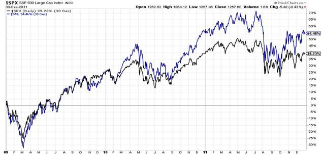
Below, we share four charts to help illustrate this observation of our current bull market backdrop compared to that of a recent historical fresh bull market run, which emerged as the bear market downturn of 2008 culminated in early 2009.
We are using the S&P 500 large-size company index alongside the S&P 600 small-size company index to compare and contrast the behaviors of each in two different time periods.
For ease of visual comparison, we have the two timeframes stacked together via percentage performance charts in order to visually compare the two periods.
The first chart below encompasses the finale of the 2009 low through 2011 in order to show the near-term follow-on behavior of the two indices as the new bull market trended upward.
The second chart depicts the entirety of the 2022 downturn and how this bull market run unfolded through to the current day.
For reference, the blue line in both charts represents the S&P 600 small-size company index, while the black line in both represents the S&P 500 large-size company index.
The history speaks for itself.
Note the excellent performance of the S&P 600 index (blue line) in the first chart as it would often lead the way in performance to that of the S&P 500.
In contrast, our current era via the second chart is unrecognizable to that of the first chart. Two bull market runs with vastly different characteristics relative to the market landscape being broad and robust in winning participation.

To underline the above with an additional visual reference, below we offer the same two indices via a percentage performance chart but present them in baseline format.
Baseline simply makes the S&P 500 index the baseline reference point from which the small-size S&P 600 index performance is highlighted relative to the S&P 500 baseline.
Simply put, the thin horizontal black line represents the S&P 500 as the baseline. The blue line depicts the small-size company S&P 600 index. When the blue line is above the thin black horizontal line, this means the small company S&P 600 index is outperforming the S&P 500.
When the blue line is below the thin black line, this means the small company index is underperforming the larger company S&P 500.
As in the above charts, the second chart below depicts our current bull market, which is unrecognizable from the first chart that is denoting the post-2008/09 bull market.
In the first chart below, the S&P 600 small company index posted consistent outperformance relative to that of the S&P 500.
In the second chart, the underperformance is startling by comparison.


The behavior of this bull market has been quite an aberration to that of historical bull market launches and runs. This is not changing.
Collective stock market participants continue to be highly selective in what they are willing to bid higher on a trend basis. The significance, as offered, is to appreciate that narrowly performing markets lead to problematic outcomes.
This does not assure that this narrow market structure will succumb to an imminent downturn, but more weakening structure across markets, to include the stock market, increases concerns.
I wish you well…
Ken Reinhart
Director, Market Research & Portfolio Analysis


Comments